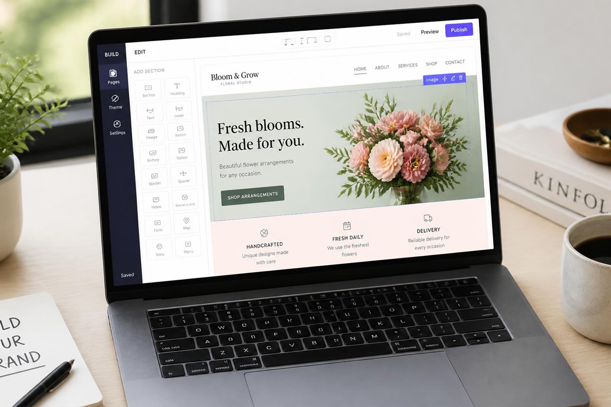
If you’ve ever driven a flood of traffic to a page and watched almost none of it turn into leads, you already know the truth: traffic isn’t the hard part. Conversion is.
A landing page is a standalone web page built for one purpose—to get a visitor to take a specific action, like signing up for a demo, downloading a guide, or requesting a quote. Unlike a homepage or a general website page, which is designed to inform visitors about many things and let them explore freely, a landing page removes distractions and points everyone toward a single next step.
That distinction matters more than most businesses realize. A homepage has a navigation menu, multiple links, and competing messages. A conversion-focused landing page strips all of that away so the visitor’s attention goes exactly where you want it—toward your offer and your call-to-action (CTA).
But here’s the part that trips people up: sending traffic to any page labeled “landing page” doesn’t guarantee results. You can have thousands of visitors and still generate almost no leads if the page doesn’t do its job. Learning how to create landing pages that convert means understanding what actually influences a visitor’s decision to act — and building every element of the page around that decision.
This guide walks through the practical, proven steps to landing page optimization, from the first line of copy to the final metric you should be tracking.
What Makes a Landing Page Convert?

A landing page converts when it delivers instant relevance, clear messaging, and a low-friction path to action. In other words, visitors need to immediately understand what you’re offering, why it matters to them, and exactly what to do next — without having to think too hard or dig for information.
Five factors consistently separate high-converting landing pages from pages that underperform:
- Relevance
- Clarity
- Trust
- Strong messaging
- Frictionless experience steps
Every recommendation in this article ties back to one or more of these five factors. If you’re ever unsure whether a change will help your landing page conversion rate, ask which of these five it improves.
1. Start With One Clear Goal
The single biggest mistake in landing page design is trying to accomplish too much on one page. A page that asks visitors to “sign up,” “learn more,” “follow us on social,” and “book a call” all at once ends up asking for nothing effectively.
Every high-converting landing page is built around one primary goal and one main CTA. Before you write a single word of copy, decide exactly what you want the visitor to do:
- Request a demo
- Download a resource
- Start a free trial
- Get a quote
- Join a waitlist
Once that goal is locked in, every headline, sentence, and design choice on the page should support it. Secondary links, extra navigation, and competing offers only dilute focus and reduce your conversion rate.
2. Write a Compelling Headline
Your headline is the first — and sometimes only — thing a visitor reads before deciding whether to stay or leave. It needs to do two things immediately: communicate the core benefit and match the promise that brought the visitor to the page in the first place.
This second point is often overlooked. If someone clicks a Google ad promising “50% off project management software,” but lands on a page with a generic headline like “Welcome to Our Platform,” that mismatch creates instant doubt. This is called message match, and it’s one of the fastest ways to lose a visitor before they’ve even scrolled.
A strong headline typically:
- Leads with the outcome or benefit, not the product name
- Speaks directly to the visitor’s problem
- Uses clear, simple language over clever wordplay
- Is backed up by a supporting subheadline that adds detail or specificity
For example, instead of “Our Software Solution,” a benefit-driven headline might read “Manage Every Project From One Simple Dashboard.”
3. Focus on Benefits, Not Just Features
Features describe what your product does. Benefits describe what the customer gets. Visitors rarely convert because of a feature list — they convert because they can picture how their life or work improves.
Take a simple example:
- Feature: “Automated email reminders”
- Benefit: “Never miss a follow-up again”
To translate features into benefits, ask “so what?” after every feature you list. Automated reminders — so what? It means fewer missed opportunities. Cloud storage — so what? It means your team can access files from anywhere.
This shift is central to effective landing page copywriting. Visitors don’t buy specifications; they buy solutions to their problems.
4. Create Persuasive Landing Page Copy
Once you know your goal and your core benefit, the copy needs to carry the visitor from curiosity to action. Effective landing page copy generally follows a simple structure:
- Identify the problem the visitor is facing
- Present your solution in clear, specific terms
- Reinforce the benefit with supporting details or proof
- Encourage action with a clear next step
Keep sentences short. Break up long paragraphs. Use bullet points for scannability, since most visitors skim before they read. Avoid jargon unless your audience is highly technical — and even then, explain it simply.
Above all, write like you’re talking to one person, not a crowd. “You’ll save hours every week” is more persuasive than “Users save hours every week.”
5. Use a Strong Call-to-Action
Your landing page CTA is the moment of decision, so it deserves careful attention. A weak CTA — vague, hard to find, or generic — can undo everything else you’ve built on the page.
A few landing page best practices for CTAs:
- Use action-oriented language
- Make it visually distinct
- Place it strategically
- Keep it singular
Small wording changes can have an outsized impact. Testing variations like “Start My Free Trial” versus “Get Started” is a simple, low-cost way to improve performance over time.
6. Keep Your Landing Page Design Simple
Good landing page design gets out of the way and lets the message do the work. Cluttered pages with too many colors, competing sections, or dense blocks of text make visitors work harder than they should have to.
Focus on:
- Whitespace
- Visual hierarchy
- Readable typography
- Mobile responsiveness
- Removing distractions — no navigation menus, sidebar links, or unrelated content that could pull attention away from the goal
Simplicity isn’t about making the page boring — it’s about making the path to conversion obvious.
7. Add Social Proof and Trust Signals
Visitors are naturally cautious, especially if they don’t already know your brand. Social proof reduces that hesitation by showing that other people have trusted you and had a good outcome.
Effective trust signals include:
- Customer testimonials with names and, where possible, photos or company names
- Star ratings or review counts from third-party platforms
- Client or partner logos
- Case studies or brief success stories
- Relevant certifications, security badges, or guarantees
You don’t need dozens of testimonials — a few specific, credible ones placed near your CTA often do more than a long list of vague praise.
8. Use High-Quality Visuals
Images, product screenshots, and short videos can support your message when used with intention. A product screenshot helps visitors visualize what they’re getting. A short explainer video can clarify a complex offer faster than paragraphs of text.
That said, visuals should support the CTA, not compete with it. Avoid:
- Generic stock photography that adds no real information
- Autoplay videos that distract from the CTA
- Oversized images that push important content below the fold
If a visual doesn’t help visitors understand the offer or build trust, it’s probably not earning its place on the page.
9. Keep Lead Forms Short and Simple
Every additional form field is a small piece of friction, and friction reduces conversions. For most lead generation landing pages, asking for only what you truly need — typically name and email — will outperform longer forms.
That said, form length should match the value of what’s being offered:
- Low-commitment offers (a checklist, newsletter signup) → keep forms extremely short
- Higher-value offers (a personalized demo, a quote, an enterprise trial) → slightly longer forms can be justified, since visitors expect to provide more context
The general rule: only ask for information you’ll actually use. If a field isn’t essential to qualifying or following up with the lead, remove it.
10. Optimize Your Landing Page for Mobile
A significant share of landing page traffic — often the majority, depending on your channels — arrives on a mobile device. If your page isn’t optimized for smaller screens, you’re likely losing conversions before visitors even reach your offer.
Check these mobile-specific details:
- Buttons and CTAs are large enough to tap easily
- Text is legible without zooming
- Forms are simple to fill out on a touchscreen keyboard
- Page load time is fast on mobile networks
- Images and videos resize properly and don’t slow the page down
Testing your landing page on an actual phone — not just resizing a browser window — will reveal issues that aren’t obvious on desktop.
11. Match Landing Pages With Traffic Sources
Message match doesn’t stop at the headline — it should extend to the entire visitor journey. The expectations someone forms from a Google ad, a social media post, an email campaign, or an organic search result should carry through to the landing page itself.
For example:
- A Google Ads
- A social media
- An email marketing
- SEO traffic
When the landing page doesn’t match the traffic source, visitors feel misled — even unintentionally — and bounce rates climb.
12. Reduce Page Load Time
Slow-loading pages hurt conversions directly. Visitors are impatient, and even a delay of a few seconds can lead to higher bounce rates and abandoned forms.
Practical ways to improve load time include:
- Compressing images without sacrificing visible quality
- Minimizing unnecessary scripts and third-party embeds
- Using a reliable hosting provider or content delivery network (CDN)
- Enabling browser caching
- Testing load speed regularly with tools built for that purpose
Page speed isn’t just a technical detail — it’s part of the user experience, and it directly affects whether visitors stay long enough to convert.
13. Use A/B Testing to Improve Conversions
Even a well-built landing page has room for improvement, and A/B testing is how you find it. A/B testing means showing two versions of a page — with one element changed — to different segments of visitors, then measuring which version performs better.
Elements worth testing include:
- Headlines and subheadlines
- CTA wording, color, and placement
- Form length and field order
- Hero images or videos
- Overall page layout
- The core offer itself
Test one variable at a time so you can clearly attribute any performance change to that specific element. Over time, small, consistent tests compound into meaningful gains in your landing page conversion rate.
14. Track the Right Landing Page Metrics
You can’t improve what you don’t measure. These are the core metrics worth monitoring:
- Conversion rate
- Bounce and engagement behavior
- Form completion rate
- Cost per lead
- Traffic sources
- Click-through rate
- Lead quality
Reviewing these metrics regularly helps you understand not just whether your page is converting, but why — and where to focus your next round of improvements.
Common Landing Page Mistakes to Avoid
Even experienced marketers fall into these traps:
- Multiple competing CTAs that split visitor attention
- Weak, generic headlines that don’t communicate a clear benefit
- Excessive text that buries the offer in unnecessary detail
- Confusing navigation that gives visitors an easy way to leave the page
- Poor mobile design that makes the page hard to use on a phone
- Generic, unspecific copy that could apply to any business
- Weak offers that don’t give visitors a compelling reason to act
- Unnecessary form fields that add friction without adding value
- Lack of trust signals, leaving visitors uncertain about credibility
Avoiding these mistakes is often just as valuable as adding new elements to the page.
How Do You Create a High-Converting Landing Page?
- Define one clear goal and build the entire page around it
- Write a benefit-driven headline that matches your traffic source
- Lead with benefits, not just product features
- Keep copy short, scannable, and focused on the visitor’s problem
- Use a strong, visible CTA with action-oriented wording
- Simplify the design and remove distractions
- Add social proof near your CTA to build trust
- Shorten your lead form to only essential fields
- Optimize for mobile and test on real devices
- Track performance and use A/B testing to refine continuously
Conclusion
A high-converting landing page gives visitors exactly what they expected, tells them clearly what to do next, and removes every unnecessary obstacle along the way.
Start with one goal. Write copy that speaks to real benefits. Build trust with proof. Simplify the design. And once your page is live, don’t treat it as finished — track your metrics, test your assumptions, and keep refining. Landing page optimization is an ongoing process, not a one-time task, and the businesses that treat it that way are the ones that see conversion rates improve over time.